
 Close
Close
The content was there. The story wasn’t.
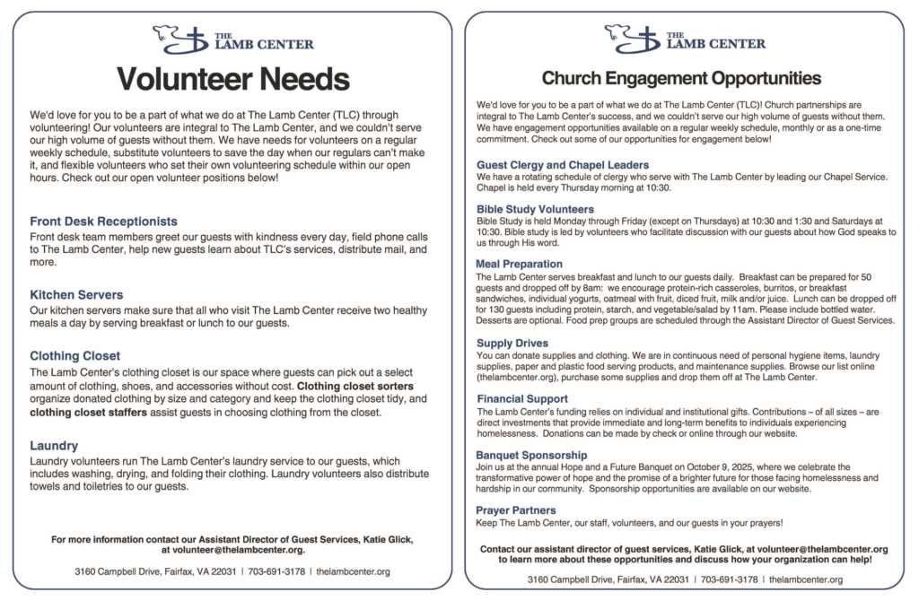
A strong trifold starts with the person holding it, not the information being placed inside it. Who is holding this? What do they already know? What are they confused about? What do they need to feel confident enough to act? For The Lamb Center volunteer piece, the original information already included volunteer needs, role descriptions, church engagement opportunities, contact details, and ways to get involved. The work was not simply making that information prettier. It was shaping it into something easier to follow, easier to trust, and easier to use.
That is where strategic design comes in.
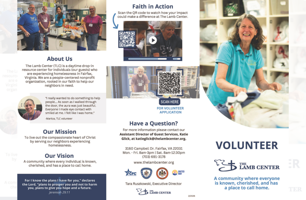
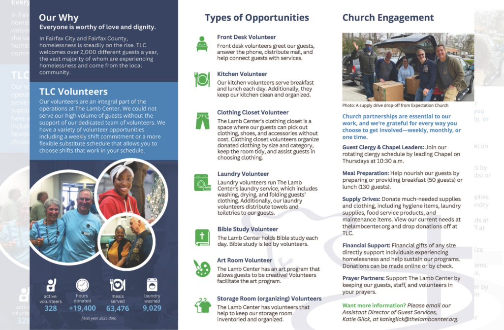
A trifold has limited space, which means every section has to earn its place. The cover has to invite someone in. The inside panels have to organize the story. The photos have to feel real and relevant. The headings have to guide the eye. The type has to be readable. The call to action has to be obvious. The final piece has to work when it is folded, held, skimmed, passed across a table, or left in a lobby.
That does not happen by accident. It’s a full-blown stategy.
Most people look at a trifold and see a small print piece, but we see a communication system.
Even something as familiar as a brochure has to make dozens of decisions feel invisible. The reader should not notice the structure. They should simply understand the message, feel oriented, and know what to do next.
That kind of clarity is not accidental. Behind the scenes, GTC considered:
Strategic design is more than making something look good.
It is the difference between handing someone information and guiding them through it.
For The Lamb Center, the redesigned trifold did more than hold volunteer details. It brought together the mission, vision, impact data, volunteer opportunities, church engagement options, contact information, and QR-code-driven next steps into one clearer path.
The content was there. It just needed structure. It needed to tell a story.
And that is often where good design does its real work.